Limited Time Discount! Shop NOW!
Leeds United’s new away shirt launch included Anton Stach walking across Ilkley Moor dressed in tweed and a flatcap, shouting “ey up!” to someone stood out of shot. The video matched the hyperlocal feel the shirt itself evokes — a white rose placed on top of the traditional yellow that Angus Kinnear promised us would never sell well.
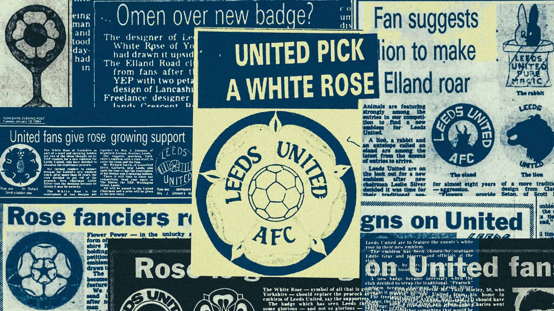
The return of the Yorkshire Rose crest also plays up to another stereotype that Leodensians are often labelled with — being tight. Leeds United chairman Leslie Silver decided that the Peacock crest the club adopted in 1980 was unlucky, having coincided with relegation from the First Division and promotion failure. So he asked the Yorkshire Evening Post to run a competition in early 1984 to find the new club crest, one that would rid United of the apparent hoodoo inflicted upon them by a fictional peacock.
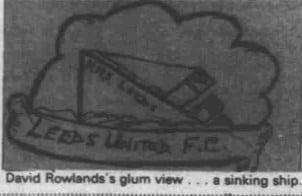
Fans got into the spirit of competition in predictably Leedsy fashion. One early design from a fourteen-year-old David Rowlands titled ‘HMS Leeds’ was simply a sinking ship with Leeds United FC emblazoned upon it, while Teddy Clark, 74, told the YEP: “They’d want to get rid of some of those directors as well.”
Brenda Reader of Bramhope was the eventual winner in June 1984, with a Yorkshire Rose crest picked out by then manager Eddie Gray and other officials at the club. Reader submitted five designs, all of which included the rose in some form. “I wanted to put together something that would be effective,” she told the YEP. “The flower and the ball seemed to be the most important element.”
The club officially adopted the crest ahead of the 1984/85 season but did not pay any design or copyright fees for it. The brand identity that defined Leeds United as they returned to the First Division under Howard Wilkinson, became champions of England and appeared in the European Cup was created by a freelance designer from the city, and the club didn’t give her a penny for it. Perhaps Reader was too nice to ask or felt like she didn’t want to deny United the chance to drop £200,000 on Ian Snodin that summer.
Reader is West Yorkshire’s answer to Carolyn Davidson, the Portland State University student who designed Nike’s swoosh in 1971. But at least Phil Knight gave Davidson $35 for it at the time. Nike later gifted her shares in the company that grew to a value of $3m and a swoosh diamond ring. But to this day, Leeds have done nothing to acknowledge Brenda Reader’s impact on the club’s history and identity.
Without access to private records, I gather that she passed away several years ago, as did her son Van. “He follows their progress more closely than I do,” she told the YEP back in 1984. I hope that the Reader family took some pride in seeing how one design submitted to a local newspaper ended up front and centre of the last true champions of English football. They aren’t around now to witness its rebirth over forty years later in an away shirt that is almost certain to break club records for sales. Leeds United trademarked the design in advance of the new shirt’s release.
It’s worth noting that Reader’s Rose wasn’t the only design submitted and after some digging into the newspaper archives and the help of Andy Shaw from Leeds Football Newspaper Snippets, we can see those displayed in the YEP at the time.
David Lee of Rothwell sketched an eagle with an angular Leeds United font above it, and I can’t decide whether it looks Albanian or, erm, the other thing. Garforth’s Richard Smith got into the floral spirit with a rose base, LUFC lettering and a spinning bobbin — a nod to Leeds’ textile heritage. Mrs J Johnson of Wortley suggested “uniting the team and the fans” with a Yorkshire rose on top of a club scarf. It’s a basic look, but perfect for a pin badge.
Mr T Middleton placed the rose on a cup, declaring it “an incentive for the future young starlets of Leeds” — perhaps youngsters like David Rowlands and his sinking ship. Others tried to embrace tradition and heritage in other ways, like Michael Langdale of Chapel Allerton with The Black Prince statue depicted — though the prince has no ties to Leeds other than his statue in City Square.
“It’s all very well using flowers and birds, but they do not provide aggression,” said Mr S Bansal of Headingley, upon providing his drawing of a lion that I could have sworn was a sheep. My favourite was Trudi Ridehough of Castleford, who drew a rabbit inside a hat that read ‘LEEDS UNITED PURE MAGIC’. Her justification? “United are magic.” Fair enough. That did make a pin badge, which Rob nearly gave to Georgi Rutter for Christmas.
These amateur designs are all much more creative and engaging than the pre-AI slop the club produced back in 2018 with the ill-fated salute badge. The mythical 10,000 fans they ‘consulted’ prior to launching United’s new crest for less than 24 hours suggested that internal and opaque decisions like this are often brainless. Instead, you’re better off having a competition full of weird and wonderful submissions.
After almost thirty years of the Leeds United shield crest, I wonder if it’s time for something new. The club have reused two old crests in the past three seasons and even featured the old Peacock crest on the back of their 2023/24 shirts.
There will never be unanimity when it comes to the logo that identifies your football club. Reader had to ‘deny’ drawing the Yorkshire Rose upside down back in 1984, with two petals on top and three below seen as resembling Lancashire’s red equivalent more than her home county’s — which has three on top and two below. “Personally I prefer the rose that way up, though opinion seem to be split 50-50,” she told the YEP. We’re Leeds fans, after all. Nobody’s ever truly happy or united.
If Leeds truly have plans to move on from the shield crest that provides minimal city identity, then perhaps an open competition is the way to go. Any AI-designed submissions will result in ex-communication, however. Hand drawn logos, lions and rabbits — we want it all.
With the club’s revenues comfortably into nine figures on an annual basis, perhaps this time they might pay their way and have a hardworking designer avoid the same fate as the late Brenda Reader all those years ago.
£3.00
£12.00
£16.00